The School Cash Online app enables parents to conveniently make online payments for their children's school fees. It is part of the School Cash or School Cash Suite, a cloud-based educational software solution tailored to meet the specific financial needs of K-12 public schools. School Cash is a comprehensive solution that seamlessly integrates online payments, fee management, lunch services, school-level accounting, and digital forms. Currently, it has been adopted by over 16,500 schools across 23 states and 10 provinces, managing an annual total of over $1.5 billion in school-generated funds.
Problem:
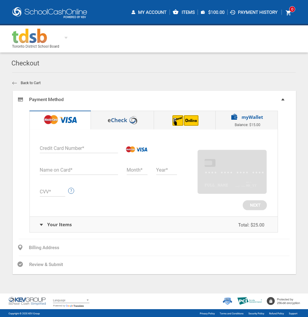
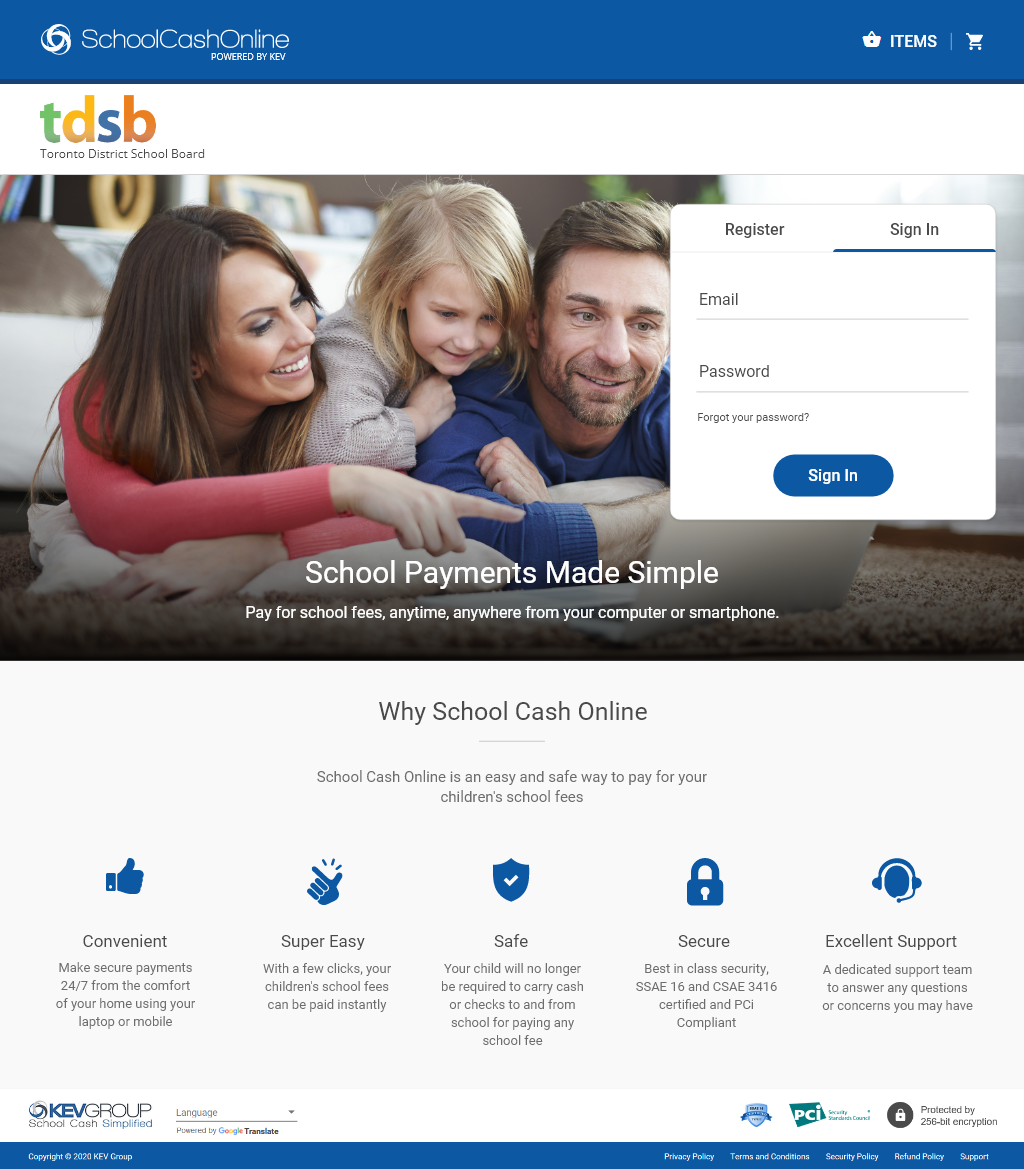
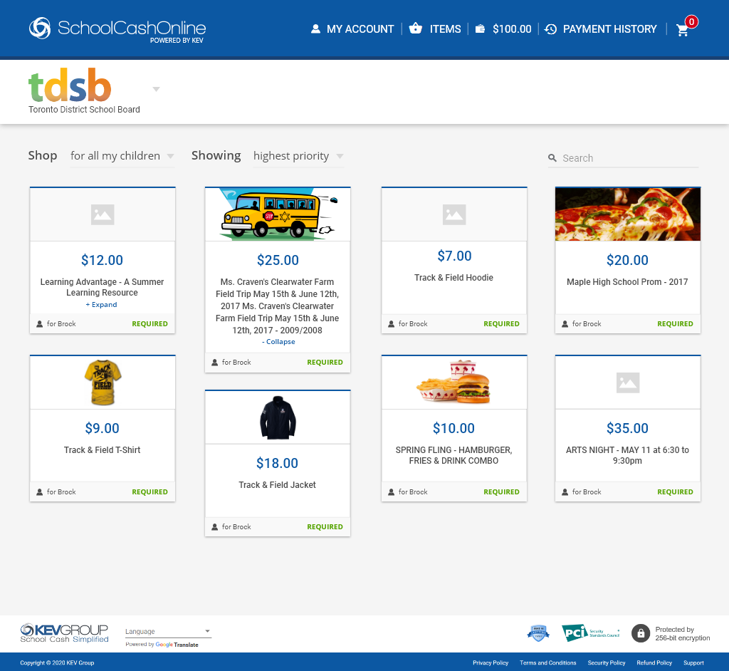
School Cash Online required a modern update to move away from its outdated 90s appearance. The demand for a mobile version was evident, with over 90% of users expressing interest. One crucial area identified for improvement was the process of loading funds to myWallet during checkout. Users often confused this step with making payments for items in their cart. Consequently, a significant number of support tickets were generated by parents, and the team was extensively engaged in responding to these tickets and processing refunds.
My Responsibilities:
Conducting User Research, Ideation, Product Strategy, UI Design, Rapid Prototyping, and User Testing.
Solution:
Redesign School Cash Online, with a focus on streamlining the checkout process and enhancing the myWallet loading solution. Give the design a fresh look and feel while maintaining School Cash Online’s branding and core functionalities.
Introduction
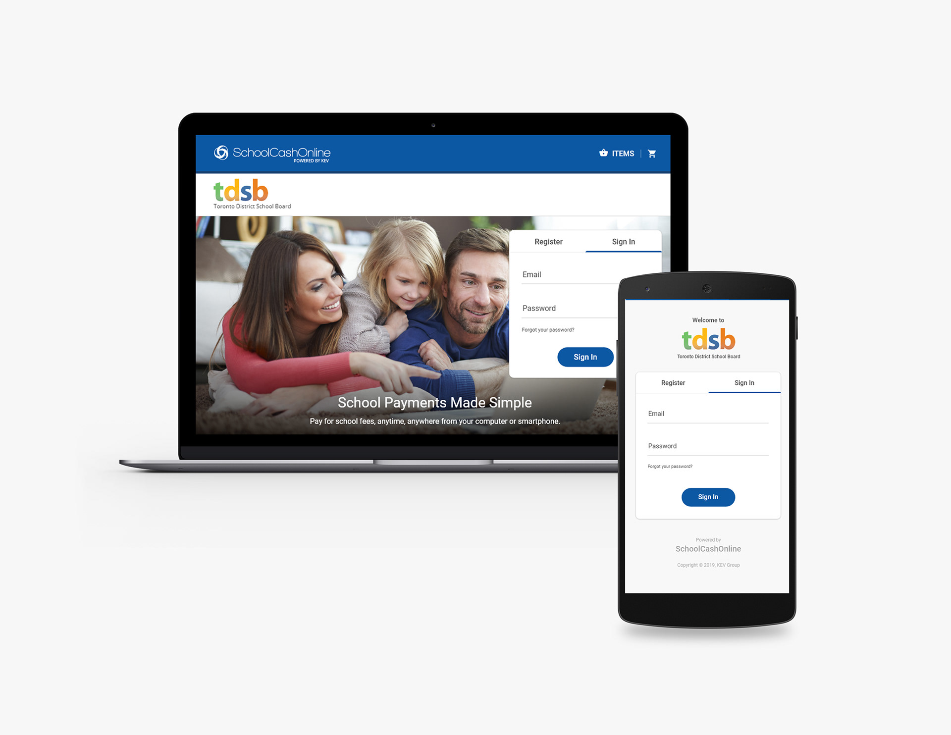
School Cash Online is currently undergoing a step-by-step complete overhaul, prompting the company to discard the old application designs and start afresh.
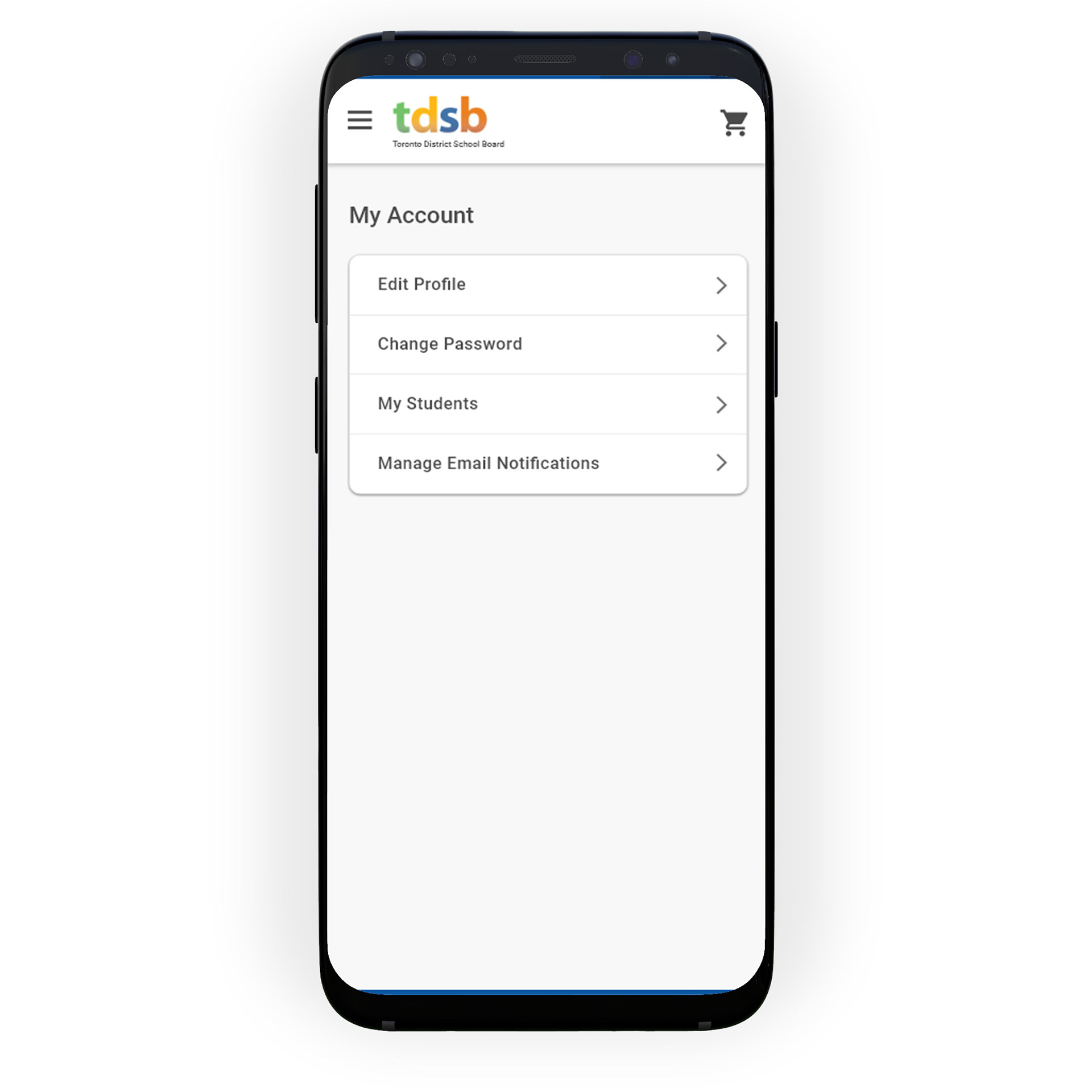
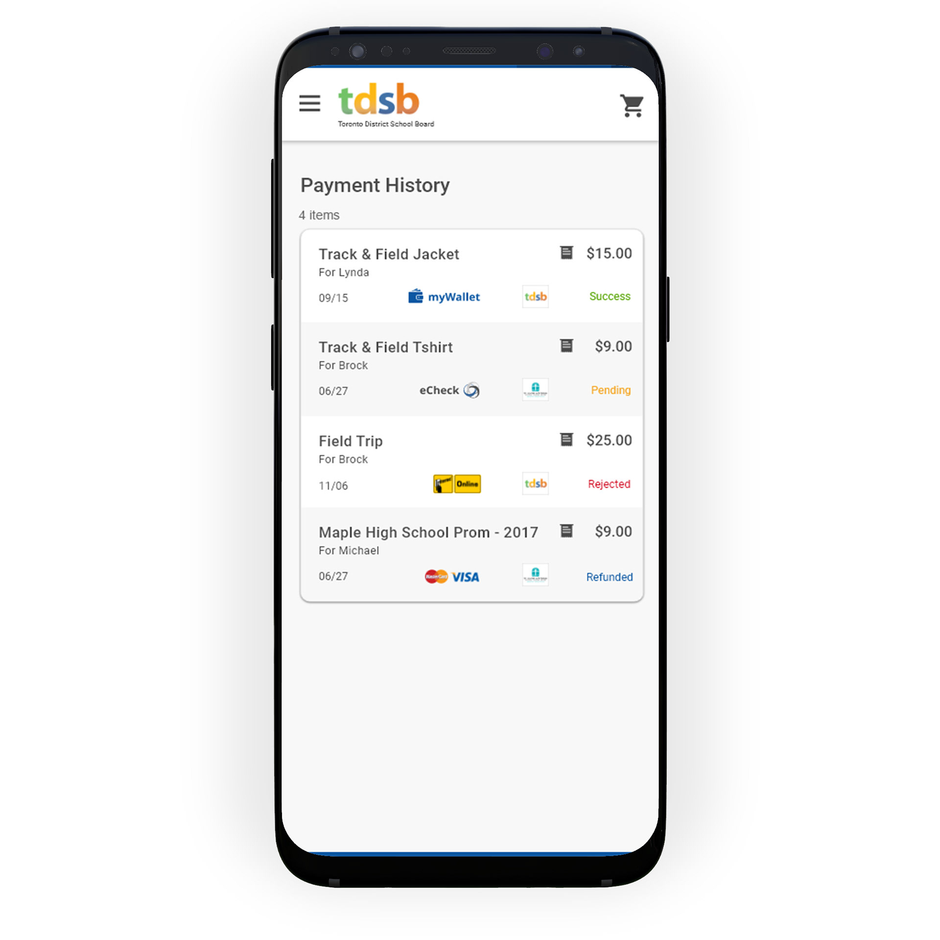
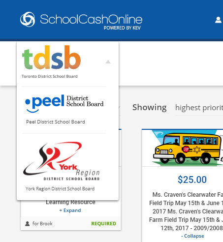
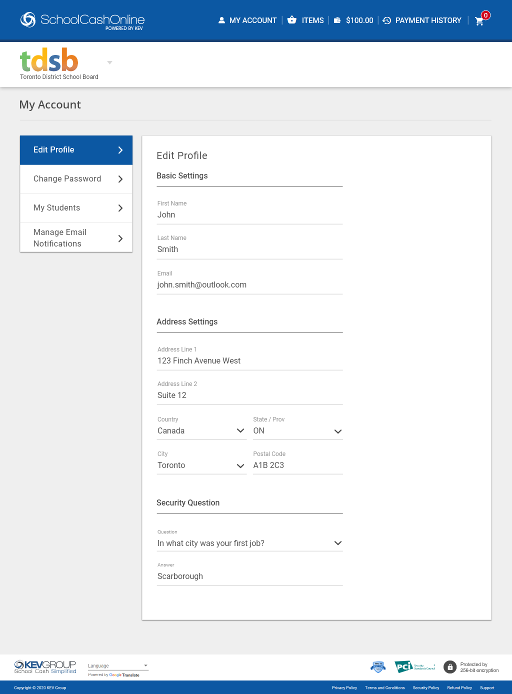
My task was to redesign the School Cash Online web application, aiming to enhance the workflow experience, and simultaneously design a mobile app from scratch. This involves introducing additional features, such as the ability to switch to a different board with a click of a toggle, more filter options for items, a detailed Payment History page, and more.
Below is an overview of a typical design sprint:
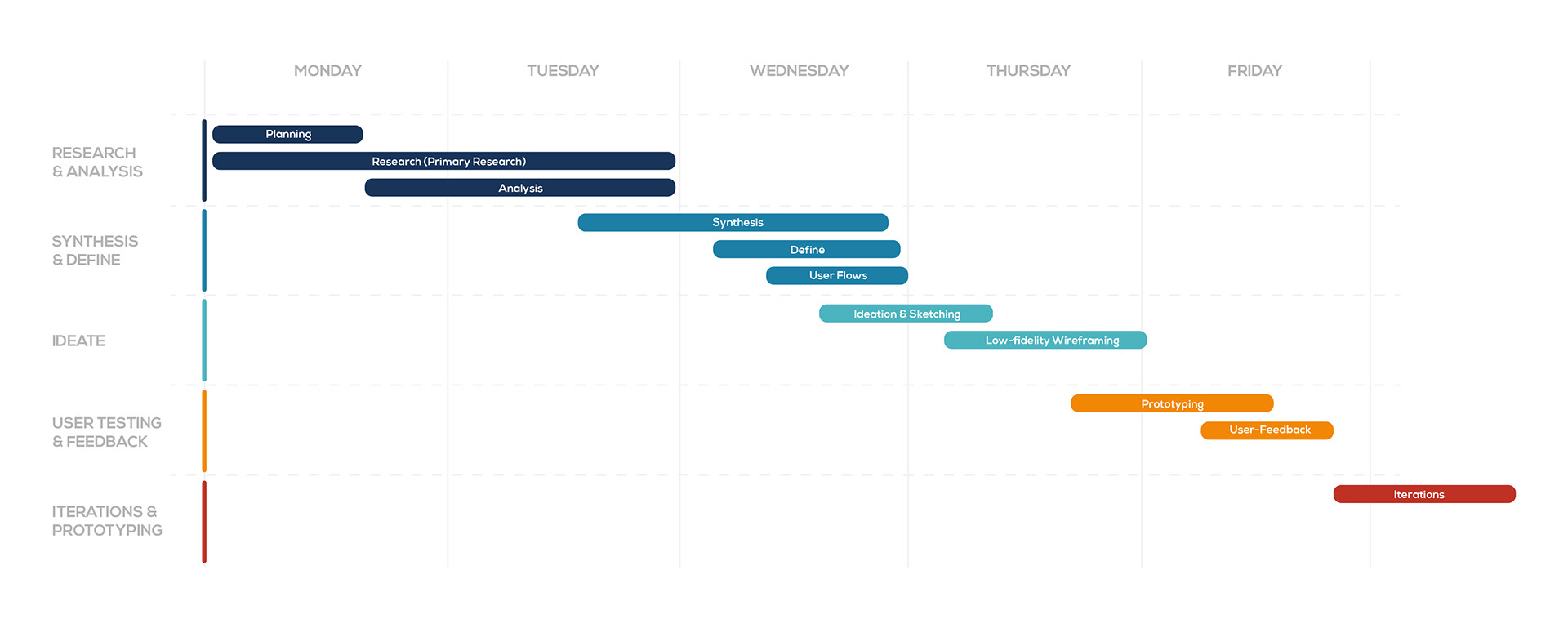
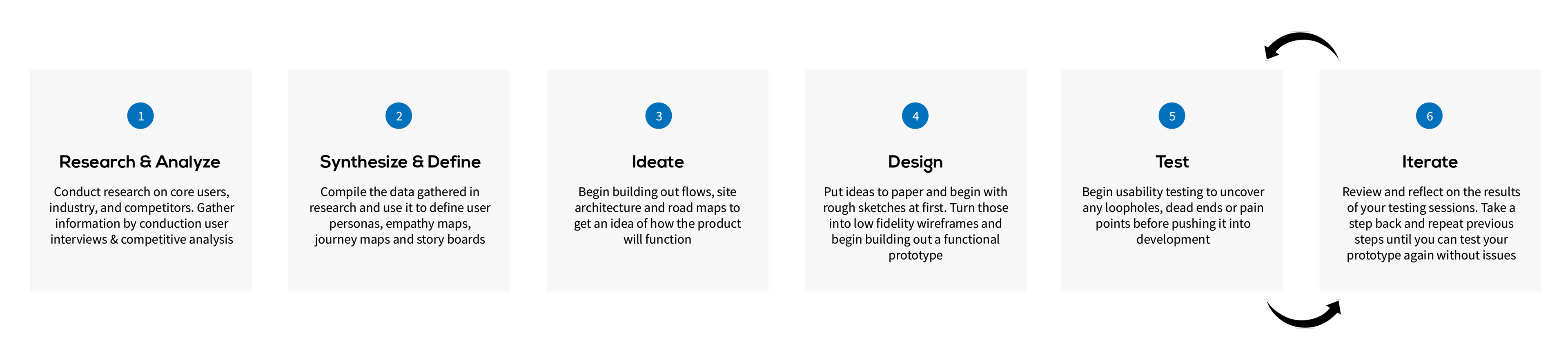
DESIGN PROCESS
DISCOVERIES & PAIN POINTS
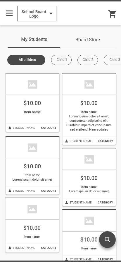
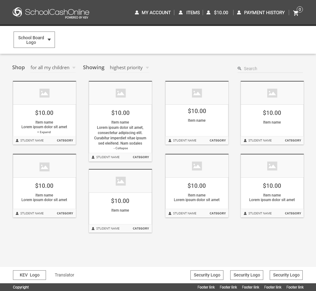
The analysis of the current scheduling experience was pivotal in the redesign project I undertook. Capturing the entire user-flow of the current scheduling experience was crucial. The in-depth analysis of the current interface helped me define what I had to work on, and this was facilitated through the use of a journey map.
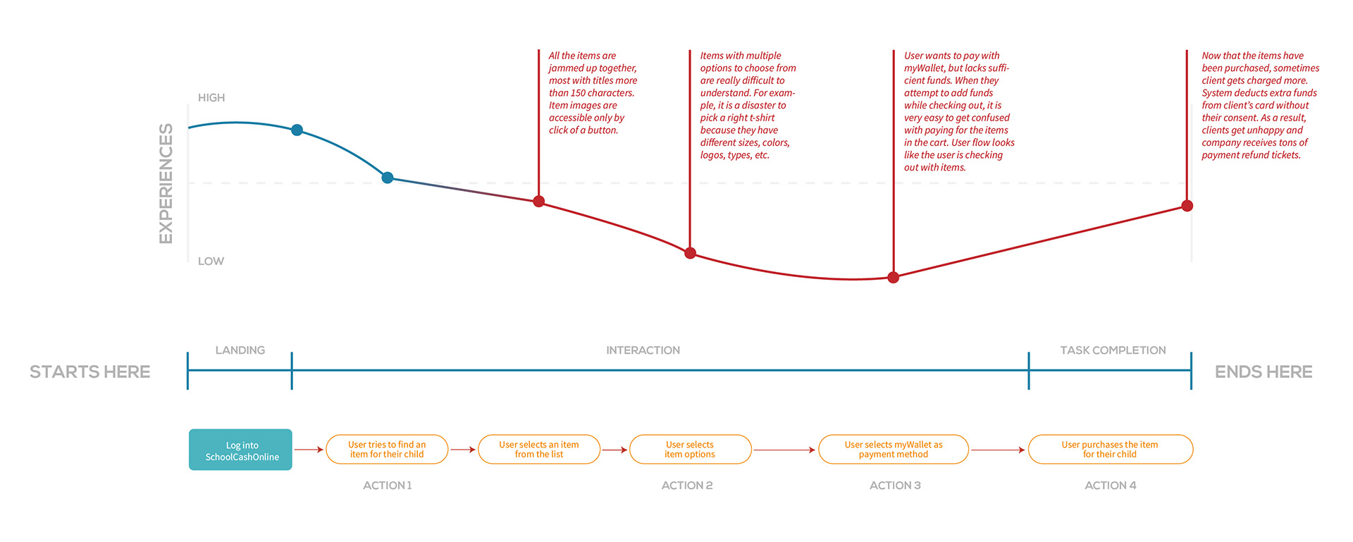
After thorough investigation, I gained a comprehensive understanding of the product's strengths and weaknesses. Here are some key discoveries derived from conversations with end users:
1. Users expressed the need for a responsive version of School Cash Online to eliminate the requirement of logging in via desktop or laptop every time.
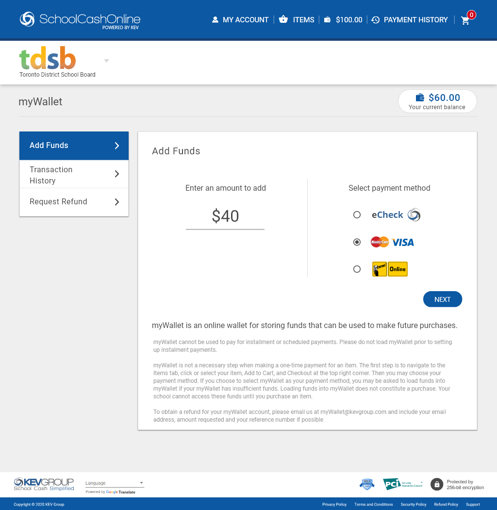
2. Confusion arose among many users regarding the distinction between loading myWallet and making payments for items during the checkout process.
3. There is a desire among some users for a feature allowing them to switch to a different school board without delving too deeply into the software.
4. Users highlighted concerns that the current School Cash Online is perceived as complex and not user-friendly.
SYNTHESIS & DEFINE
Upon uncovering these new insights, I promptly realigned the design objectives and collaborated with product managers to articulate the key features and project scope. With the project scope redefined, the next step was to focus on the core users of the product. To gain a profound understanding of our users' needs, desires, motivations, and pain points, I developed persona profiles and empathy maps. These resources served as constant references during feature development meetings, enabling the team to address and emphasize the problems and pain points our users might encounter.
IDEATION & EXPLORATION
Once I gained a clearer understanding of the essential features that needed inclusion and the problems requiring solutions, I dedicated time to sketching layouts and experimenting with various design approaches. I prefer low-fidelity sketches as they allow me to quickly identify what works and what doesn't. This iterative process enables easy adjustments. Additionally, these sketches serve as a valuable tool for gathering feedback before progressing to detailed wireframes.
USABILITY TEST FEEDBACK
According to user feedback, 70% of participants (7 out of 10) expressed a preference for the School Board toggle and the floating search button on mobile devices. The consistent theme in the feedback highlighted that users are accustomed to modern navigation styles in their daily interactions.
LET'S TAKE A CLOSER LOOK AT THE DETAILS
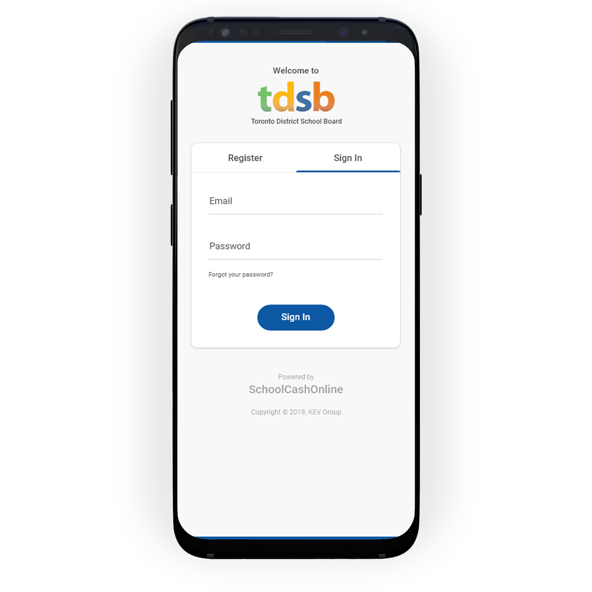
1. Users now have the School Cash Online mobile app
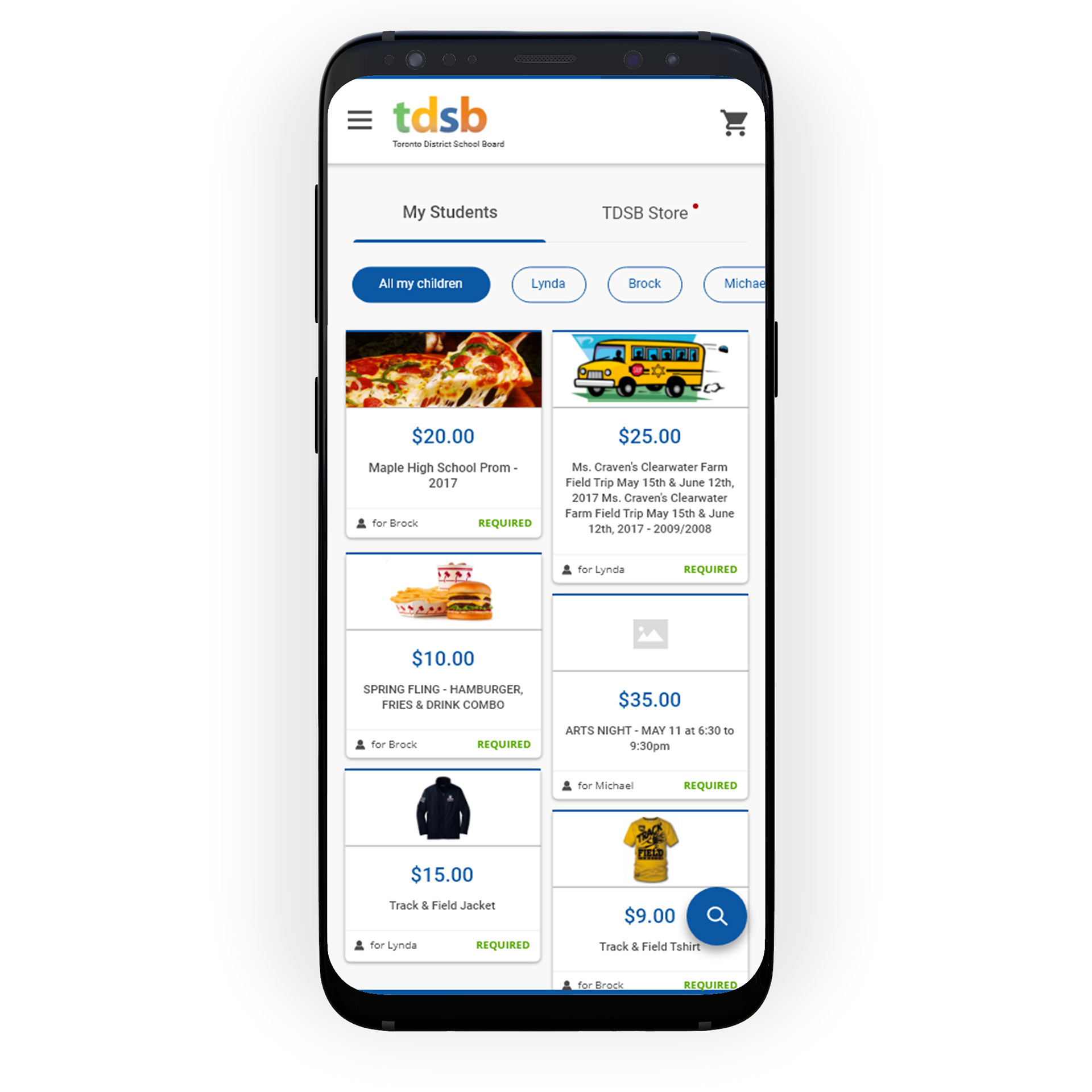

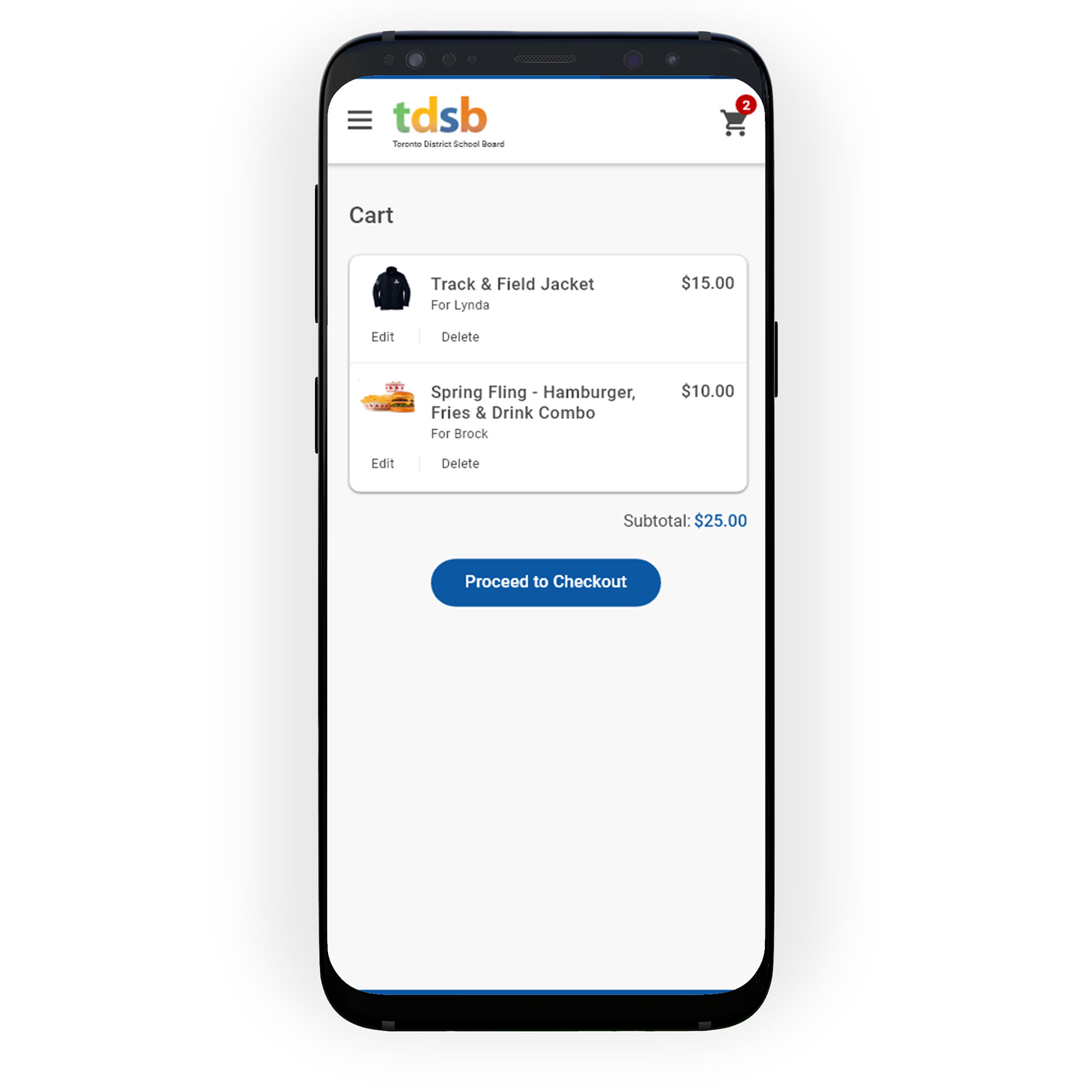
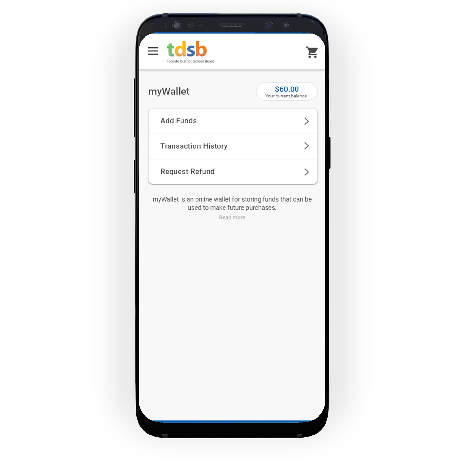
2. Funds can be loaded into myWallet separately as opposed to loading during the checkout process
3. School board can be switched using a toggle in sub header
4. Users can now use fresh, user friendly and new School Cash Online web and mobile application
SUMMARY
Continuously testing out my design and receiving feedback from the end users throughout the design process has really helped me to make sure the designs are addressing the right problems while also making sure the experience is intuitive and easy to use for the users.
NEXT STEPS
I’ve collaborated closely with our product manager to break down the final design into small incremental releases. We emphasized prioritizing features that are easiest to implement while yielding significant results. As a brand-new product, our objective is to design a minimum viable product (MVP). It’s crucial that we validate our design hypotheses to ensure we deliver the best possible product.